
B L A C K M A G I C
Wine Label Design
Wine Label Design
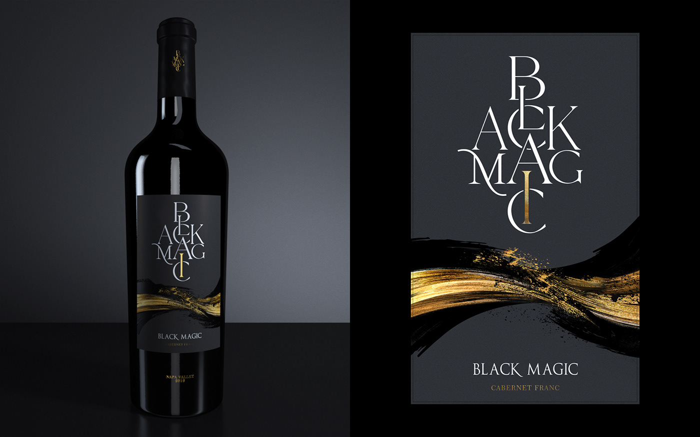
The Black Magic Wine Label Design - A Study in Transformation.
My inspiration to create the Black Magic Wine label came from the ancient practice of Alchemy and the metaphor of
"turning lead into gold." The name "Black Magic" alludes to the mysterious and dark art of alchemy, much like the magic of winemaking that transforms grapes into a premium, flavorful product.
From growing and harvesting the grapes to fermenting and aging the wine, every step of the winemaking process requires skill, knowledge, and unwavering attention to detail. And it's this process that inspired the design of the Black Magic Wine label.
The label features splashes of black and gold, symbolizing the transformation of lead into gold and of grapes into wine. The logo, with typography resembling alchemy symbols, takes center stage, with high and low embossing adding depth and texture to the design. The artwork was developed in gold and black, emphasizing the transformation and elevating the experience.
This is a case study of the power of design and how a simple label can embody the spirit of transformation and bring the magic of alchemy to life with every sip. So raise a glass and join us on this journey as we turn grapes into gold, one bottle at a time.


Thank You!


